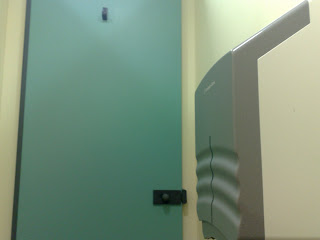
I photograph toilets.
This means that some of the little mental map icons have related images attached to ratings now. Sheffield train station: AVOID. Copenhagen airport: Import a 'number 1' with reckless abandon - these toilets are lovely.
The reasons for the ratings range from practicality to aesthetics - space for a sanitary disposal unit (SDU), space for your ass, inherent design flaws in the SDU and related mess of the cubicle...width has a lot to do with it. In fact, the whole thing started when I was doing action research for my comedy performance lecture on public sanitary disposal, The SDU and YOU.
After this past weekend, sadly, my tiny bladder is no longer overjoyed with Marks and Spencer's second story standby in the centre of town - you have to be Narrow McNarrowstein to feel the facilities are, in fact, facilitating anything like the relief you're after. The height is also a concern, unless you need a handy armrest. I can't get that comfy in a public toilet though, no matter how much good reading matter I have in my tote. It's confusingly huge and could be a bidet, or a baby changing table or something. Maybe a drinks cabinet. Amazingly, the cubicle photographed above is not the narrowest in town, in that you can actually see space between the SDU and the bowl, so I'll not complain any more about this photo.
But, to quote Kermit the Frog in Christmas Eve on Sesame Street, let's view the problem from another angle:
The toilet paper dispenser is in my 'dance space', as it were. Come on, M&S, I have just about managed to learn to replace the empty toilet roll in my bathroom at home with a new one as soon as the old one gets used up (Does this make me a grown up? Or would a real grown up be mature enough not to ask?), how come you can't get your ducks in a row? Next refit, let's go for wider cubicles (or hey, even actual cubes maybe) and a more minimalist design all round.
Coincidentally, I added this rating to my toilet topology on the same day the Guardian G2 ran an article about women and the design of public spaces. I was psyched to discover that there is a women's design service, and that they actually have produced a definitive work about toilet cubicle design. I was just as unsurprised to read measurements and statistics evidencing male-centric urban design. Read the article at the link above, and check outthe WDS website Gendersite for articles and case studies on women and public inconveniences.
And as usual, check back here for updates to my own personal (if ad hoc) case study.
Chella
P.S. Some of the other maps in my head include: Subway Stops, Cafes that have Soy Milk, Copy Shops and Branches of Muji.


1 comment:
Oh girl, did you know I joined you in this public restroom party a while back? I always think of you and SDUs when I'm out and about (and I promise that's a compliment). Other great public spots to pee in Copenhagen include in department store Magasin. If only the folks who clean that place knew how much better they've made my many days stuck downtown for one reason or another. I photographed the nice little "number one/number two" flush buttons in several stalls for my zine too. My friends back home are stunned that you can choose your water flow based on your deposit. If only we could pick and choose our imports and exports...
xo
b
Post a Comment